We’ve always been drawn to the impact movie posters can have on the legacy of films and you’ve only got to look at the likes of Star Wars, Indian Jones: Raiders Of The Lost Ark, E.T., Back To The Future, Alien, Jaws or Attack Of The 50-Foot Woman to see that movie posters can be just as memorable as the films themselves.
In our tutorial, we’re going to use the 2015 adaptation of Macbeth as our example film, which should give us a lot to work with, because it’s got well-recognised themes and characters to build on. We haven’t spent too much time on putting together the examples, as there are quite a few, but hopefully they give you enough inspiration and direction to help you create a movie posters for yourself. We tried to cover a lot of bases too, so whether you go for a minimalist approach or the kind of graphic art style you can see in Tom Jung’s Star Wars poster then our tutorial should help you create your own masterpiece.
Choose your movie poster size
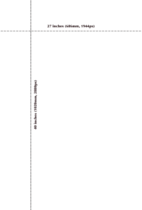
However, if you go on to create more movie posters then you might want to try some of the other popular sizes below (all pixel sizes are at 72dpi):
Advertisement- Bus stop or subway poster – 40 inches by 60 inches (1016mm x 1524mm, 2880px x 4320px) – portrait format
- Quad – 30 inches by 40 inches (762mm x 1020mm, 2160px x 2880px) – landscape format
- Double crown – 20 inches by 30 inches (508mm x 762mm, 1440 x 2160px) – portrait format
- Two sheet – 41 inches by 54 inches (1040mm x 1370mm, 2952px x 3888px) – landscape or portrait format
- Three sheet – size 40 inches by 81 inches (1020mm x 2060mm, 2880px x 5832px), portrait format
- Twenty four sheet – 246 inches by 108 inches (6250 x 2740mm, 17712px x 7776px), landscape format often called a billboard
For more information, you can see a fairly substantial list of movie poster sizes at https://en.wikipedia.org/wiki/Film_poster#Sizes.
Styles of movie poster to create
Once you know what size of movie poster you’re going to create, it’s time to look at what style of poster you’re going to go with. Broadly speaking, there are four main options to choose from – minimalist, image, graphic art and retro – and all of these should be fairly familiar to you. We’ve put together examples and guides on how to to create each style of movie poster using our Macbeth example, so no matter which you go for as your first project you’ve got more than enough to go on.
How to create a minimalist movie poster
The internet and social media has gone nuts for minimalist movie posters in recent years with everything from classics like Star Wars and Psycho to modern-day gems like Avengers Assemble and Black Swan getting the stripped-back look. However, not all examples of these are done as fan designs though, some of them come directly from the original posters themselves, like Anatomy Of Murder and Vertigo, both of which are classic James Stewart movies.
Badges also make up a big part of minimalist movie poster art in terms of original posters for films like Ghostbusters, Batman, and Jurassic Park. With each of these getting either a reboot or sequel in recent years – Ghostbusters 3, Batman Vs Superman: Dawn Of Justice and Jurassic World – the minimalist badge style poster is just as popular as ever.
However, Macbeth doesn’t really lend itself very well to the badge style minimalist movie poster, so we’ve used motifs from the story to focus the design on. The idea behind this is that you lock onto a theme, character or concept from the movie and boil it down to its most basic design, usually as a shape or a simple icon to represent it, for example an iceberg graphic for Titanic, or a shark fin for Jaws.
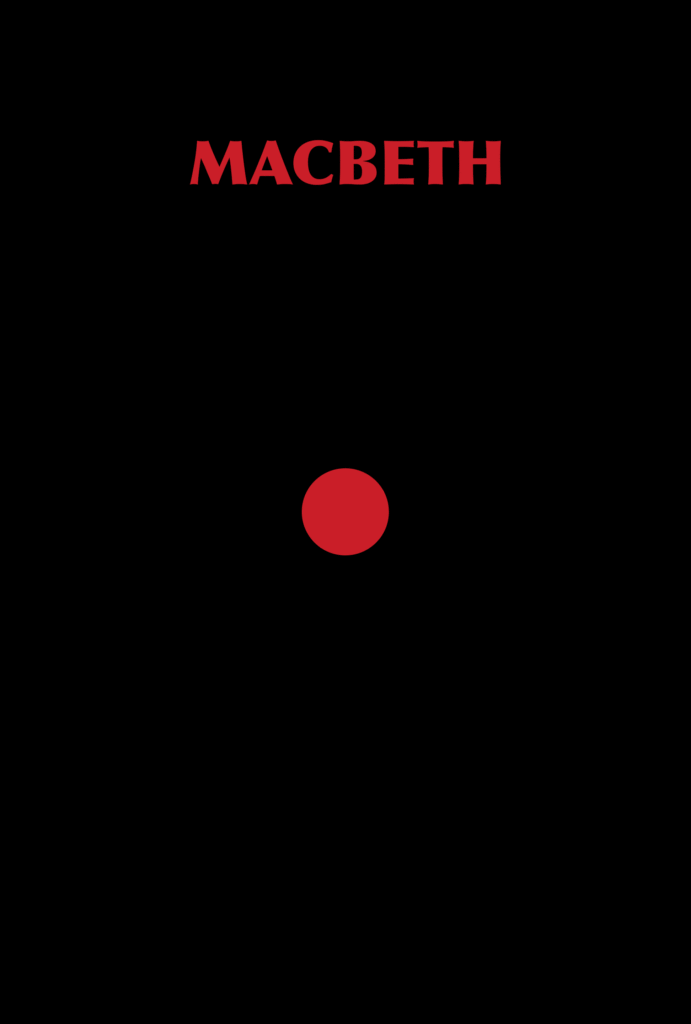
For Macbeth we’ve started out with a simple red circle, which refers to Lady Macbeth’s madness at the blood on her hands and the immortal line, “out damned spot”. This is pretty easy to recreate in a design package like Photoshop or Pixelmater with background colour, the ellipse shape tool and text tool – the font is just Optima ExtraBlack for anyone interested in replicating it.
While this works well enough in the context of the upcoming movie adaptation, it can be added to with a little extra effort to make it a little less minimal. We took the very simple design above and added a dagger shape which we drew using the pen tool. The easiest way of doing this is to find a picture of the item that you want to draw and simply pen dot around the outside of it. For anyone not too sure on how to use the pen tool, MelissaEvans.com has got a pretty easy tutorial to follow along with a few starter exercises – https://www.melissaevans.com/tutorials/how-to-use-photoshops-pen-tool.
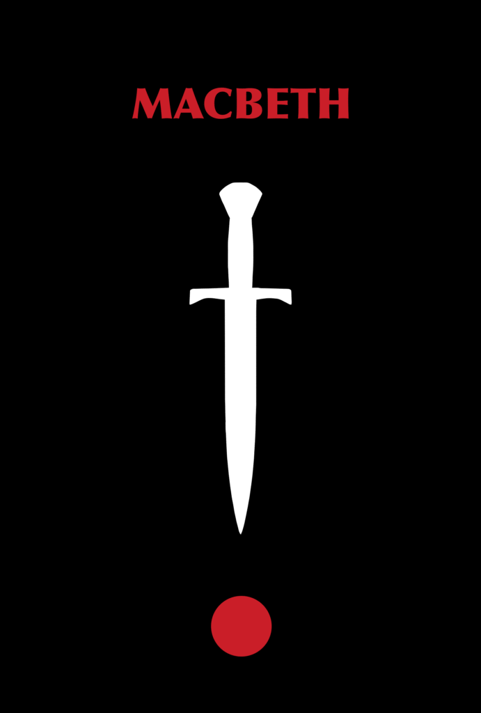
We took a little inspiration from Tom Jung’s light sabre cross to show the good versus evil struggle that takes place in Macbeth, along with the spiritual references in Shakespeare’s story and the mental torture of its antagonists. The combination of the dagger and the spot looks a little like an exclamation mark, highlighting the high-drama of the great tragedy. It’s good to try to use ideas like this to pull together your poster and to give it a little more depth.
Simple silhouettes are often used in minimalist movie posters too, and again the pen tool is a really good asset to use in this situation. For the third minimalist movie poster we created, we just drew three witches hats and a cauldron with the pen tool and before you can say hubble bubble you’ve got a brand new design.
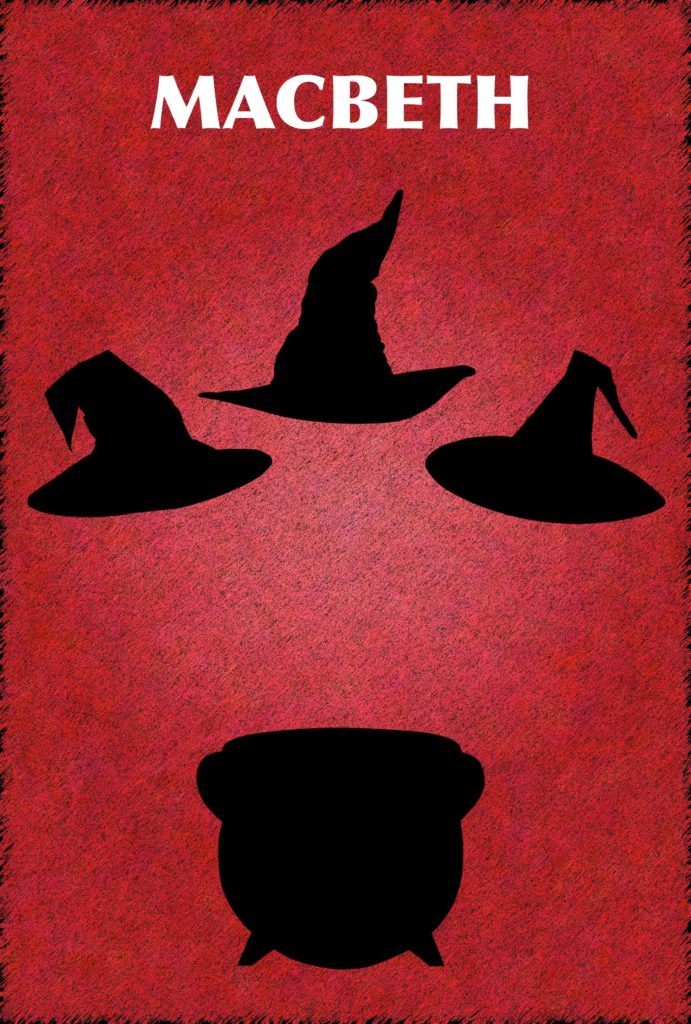
The textured effect on the red background is also pretty easy to accomplish in Photoshop. It’s just a case of adding in a new solid colour fill layer in, red in this case (hex code: #bc051f), and applying noise, sprayed strokes and stained glass filters.
AdvertisementHow to create an image movie poster
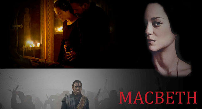
Image-based movie posters are usually much less time intensive to create than the other styles, so they’re a good choice if you’ve already got a pretty good photograph to work from. Luckily, Film 4 has already released a few good images for Macbeth (2015), so we’ve used one to provide an example of how to put together an image film poster. We’ll cover layout, composition, text and colour below, but in general it’s just a case of dropping everything in and moving them around until you’re happy with them.
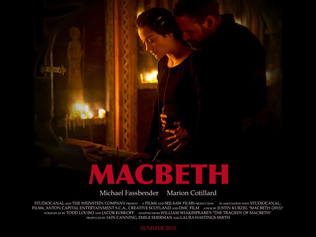
We used the Quad movie poster size for this one, as the image works better in landscape. To get the vignette effect on the image to allow you to overlay text and reduce hard lines, you just go to custom lens correction filter and tweak the vignette settings to be completely dark and with a midpoint of around +40. We applied this a couple of times to complete the look and used the smudge and blur tools to get the slight fish-eye look around the edges.
How to create a graphic art style movie poster
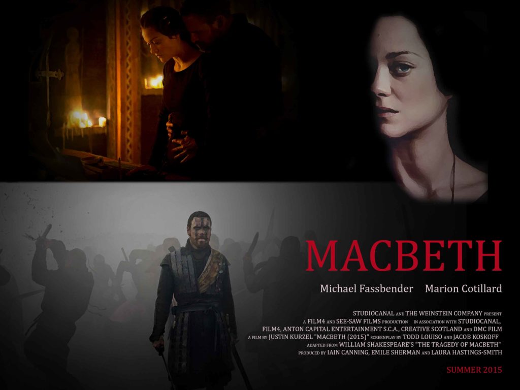
Graphic art style posters like those created for Blade Runner or Star Wars have become iconic, building on their retro predecessors like Gone With The Wind. Sadly, our illustration skills aren’t anywhere near as impressive as legendary poster artists like Tom Jung and John Alvin, but if yours are then it’s just a case of drawing up your design. However, for everyone else there are a few relatively easy techniques you can use within Photoshop to achieve a similar style without having to painstakingly draw everything.
Once again it’s a case of applying a little vignette to isolate the centre of the images you use. This will also give you the opportunity to combine images a little easier, but you might also want to use the brush tool, feathered eraser or pen tool cutouts to isolate certain areas of the image, like Marion Cotillard’s face below. The magic part is in applying some stylised filters from the filter gallery to get the illustration effect and the filter we used in our Macbeth example below is dry brush, but you might want to play around with a few until you get the look that you’re searching for.
How to layout a movie poster and tips on composition
When it comes to composing the movie poster you want to create, your best bet is to find one that you think is comparable in terms of what you want to achieve and use that as a frame of reference. We’ve added in some great movie poster inspiration links below to help you see some of the best examples and then it’s just a cast of looking how they’ve composed it to bring it all together.
When you start to create your first poster and you’ve chosen the size and style of poster you want, the final step is identifying where the text is, how it relates to the image, whether or not you want to add in the movie production and distribution company logos, movie rating, frames or montage images etc. Sadly, there’s no definitive answer to this, so anything goes, but the best tip we can give you is to take inspiration from the professionals and you won’t go too far wrong.
Text selection
There’s a lot of importance in your text selection to the composition of your poster, not just in terms of the colour and font, but also where you place it, how big it is and whether it’s created using the text tool or designed from scratch, as was the case with the Star Wars title. If you’re not too sure what credits you need to add in, you can either take a look at a few professional film posters to follow, or you can use the text we added to the illustrated and image posters above (replacing the names with those for your movie):
“StudioCanal and The Weinstein Company present, A Film4 and See-Saw Films production In association with StudioCanal, Film4, Anton Capital Entertainment S.C.A., Creative Scotland and DMC Film A film by Justin Kurzel “Macbeth (2015)” Screenplay by Todd Louiso and Jacob Koskoff Adapted from William Shakespeare’s “The Tragedy Of Macbeth” Produced by Iain Canning, Emile Sherman and Laura Hastings-Smith”
It’s quite popular for film credits to be a mix of font sizes with the names of the stars, companies, adaptation credits and the movie itself in a larger font than the note text, e.g. “In association with…” This is pretty easy to accomplish in Photoshop with the text tool; you just highlight the section you want and change the font size.
If it’s just a teaser poster, instead of a full movie release poster, you don’t really need to add in that much text at all; just the title and release date is good and you can mix this up with either a strap line or the names of the stars of the film. For minimalist posters you’re probably best just going with the title of the film, possibly even incorporating it into the stripped-back design somehow. For example, we could have written Macbeth inside the blood spot, or down the centre of the dagger’s blade.
Colour selection
Colour is another important compositional device to think about when you’re starting to create your movie poster. Matching this to the subject matter of the film is key, for example dark and light for Star Wars to show the struggle between the two sides of the force, or black, gold and red for Macbeth, to show the themes of death, murder, power, kingship and the supernatural.
Font colour and background will need to be chosen carefully to make sure they compliment eachother and feel a part the overarching direction of the poster. If you’re looking for a bit of help on this score, check out some basic colour theory at https://www.colormatters.com/color-and-design/basic-color-theory.
Great movie poster inspiration
For us, taking a look at other great movie posters is a key part in crafting your own design. You don’t need to do it entirely on your own, because there’s a raft of great designs for you to use as a pointer in the right direction, along with our tutorial. If you’re going minimalist, a good place to start is a simple Minimalist movie poster images search in Google, which throws up more inspiration than you’ll ever be able to make it through entirely. However, if you’re looking for the greatest movie posters of all time, the guys at Creative Bloq have put together a pretty nice top 25 for you to peruse – https://www.creativebloq.com/movies/iconic-movie-posters-712378.
Let us know how you get on in the comments block below and make sure you share the tutorial far and wide, whether through social media, your own site or your favourite forum or creative community. We’ll also add in your examples to the post if you send them in to us, as we’re certain that you can do a much better job than our Macbeth demos, which we put together over the course of a single weekend. We wanted to show how simple it was to get things on the road, but with more time and care you should be able to create some amazing movie posters, so please share them with us.


Very good, thanks!
Thank you so much! This really helped me get an idea of how to compose a movie poster for English 9! Keep up the hard work!
😀